Custom Dashboards
Custom Dashboards let you combine pre-built charts from the app's built-in dashboard catalog, or build new charts from scratch using two query builders: ES Builder (ElasticSearch-based) and Prometheus Query Builder. Charts are arranged in a 12-column resizable grid, and you can create, edit, duplicate, and delete dashboards at will.
Getting Started
Accessing Custom Dashboards
- Open the Monitor application and navigate to the main Dashboards page.
- In the left sidebar, switch to the Custom tab.
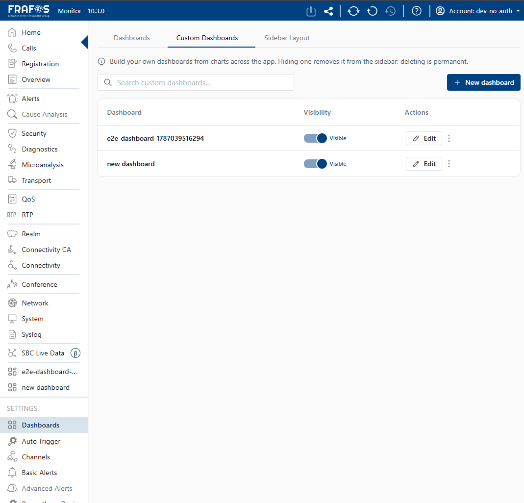
- You will arrive at the Custom dashboard manager, which displays a table of all your existing custom dashboards.
The Custom tab info message explains: "Build your own dashboards from charts across the app. Hiding one removes it from the sidebar; deleting is permanent."
Creating a Dashboard
From the Custom dashboard manager, click the "New dashboard" button (a blue button with a + icon, top-right of the page).
A modal opens with the following options:
- Dashboard name (required, up to 60 characters) — a descriptive name for your dashboard.
- Description (optional, up to 280 characters) — a longer explanation of what the dashboard monitors.
- Starting point — choose between:
- Blank dashboard — start empty and add charts yourself.
- Duplicate a dashboard — pick one of the built-in dashboards (Home, Calls, RTP, etc.) and copy its charts into your new custom dashboard as a starting point.
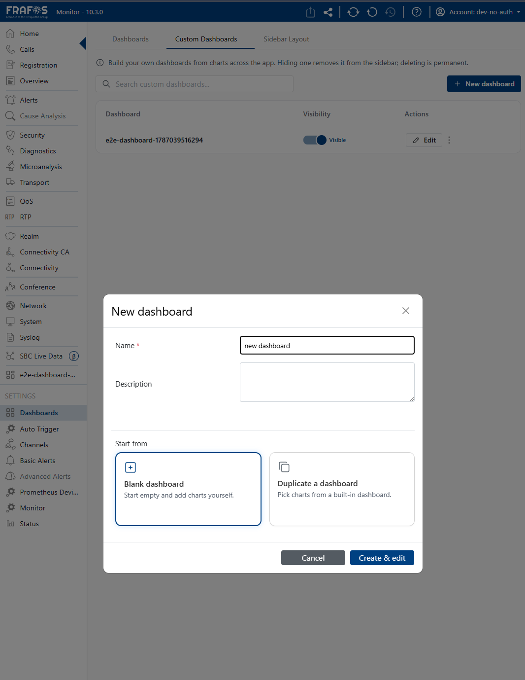
Click Create (or Create & edit if adding charts upfront). If successful, you are taken to a new empty dashboard view.
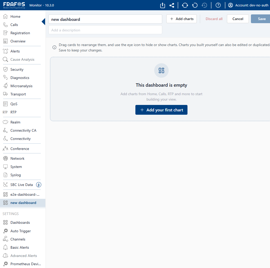
On a fresh dashboard, you will see a centered empty-state message: "This dashboard is empty. Add charts from Home, Calls, RTP and more to start building your view." with a big "Add your first chart" button.
Adding Charts
Click "Add your first chart" (or the "+ Add chart" button from the dashboard header) to open the Add chart drawer on the right side of the screen.
The drawer has two tabs:
Catalog
The Catalog tab shows a searchable, browsable list of all pre-built charts available across every built-in dashboard in the app.
- Search bar at the top — type to filter charts by name, description, or source dashboard.
- Source rail on the left — click to filter charts by the dashboards they belong to (Home, Calls, RTP, Alerts, etc.).
- Chart list on the right — each entry displays the chart name, a description (if available), and a badge indicating which dashboard it comes from.
- Charts already added to your dashboard are shown with an "Added" button (green checkmark). Click it to remove the chart.
- Click "Add" (outlined button) to place the chart onto the grid.
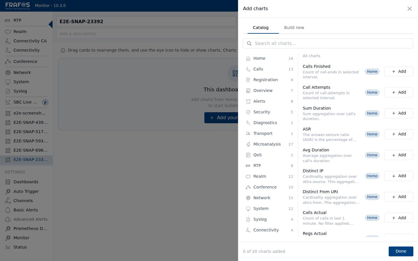
Charts from the catalog preserve their original configuration and data source. You cannot edit a catalog chart's query — to do that, build a new chart using ES Builder or Prometheus instead.
Building New Charts
Switch to the "Build new" tab inside the drawer. Here you can construct a chart from scratch using one of two query builders.
ES Builder (ElasticSearch Query Builder)
The ES Builder lets you build charts from ElasticSearch-indexed data streams. Configure your chart step by step:
Step 1 — Data Stream
Choose the data source this chart will query from:
| Data stream | Description |
|---|---|
| Calls | Call, registration & SIP signaling data |
| RTP | RTP packet, loss & jitter data |
| Exceeded | Events that exceeded configured conditions |
| Alarms | Alarm records with severity |
| Collectd | Host, network & service metrics |
| Syslog | System & application log messages |
Step 2 — Metric
Select an aggregation type and the metric field to aggregate:
- Aggregations:
count,sum,avg,min,max,cardinality - Field: Choose the specific field from the selected data stream.
Step 3 — Compare (Optional)
Toggle "Compare" to enable a secondary metric, allowing you to display a comparison between two different aggregations side by side.
Compare cannot be used together with Group by. If Group by is enabled, the Compare option will be locked.
Step 4 — Group by (Optional)
Group the results by a selected field. You can also configure:
- Size — number of top groups to show
- Order — ascending or descending
- OrderBy — which metric to sort by
Group by cannot be used together with Compare.
Step 5 — Filters
Add filters to narrow down the data. Supported filter operators:
| Operator | Description |
|---|---|
is | Exact match |
is_not | Not equal to |
exists | Field has a value |
not_exists | Field is empty or missing |
gt | Greater than |
lt | Less than |
between | Between two values |
contains | Value contains the specified text |
Step 6 — Visualization Type
Choose how the data is rendered. The app suggests compatible visualization types based on your data configuration:
| Visualization | Description |
|---|---|
| Value | A single numeric value |
| Line | Time-series line chart |
| Time bars | Bar chart showing time-distributed data |
| Bar | Categorical bar chart |
| Donut | Donut/pie chart |
| Table | Tabular data with multiple rows/columns |
| Heatmap | Intensity-based grid visualization |
Heatmap visualizations always span the full 12-column width of the grid.
Step 7 — Name
Enter a title for the chart (max. 60 characters). This title is displayed on the chart card within the dashboard.
Live Preview
As you configure the chart, a live preview pane updates in real-time, showing you a sample of the data visualized with your current settings. You can collapse and expand this preview at any time.
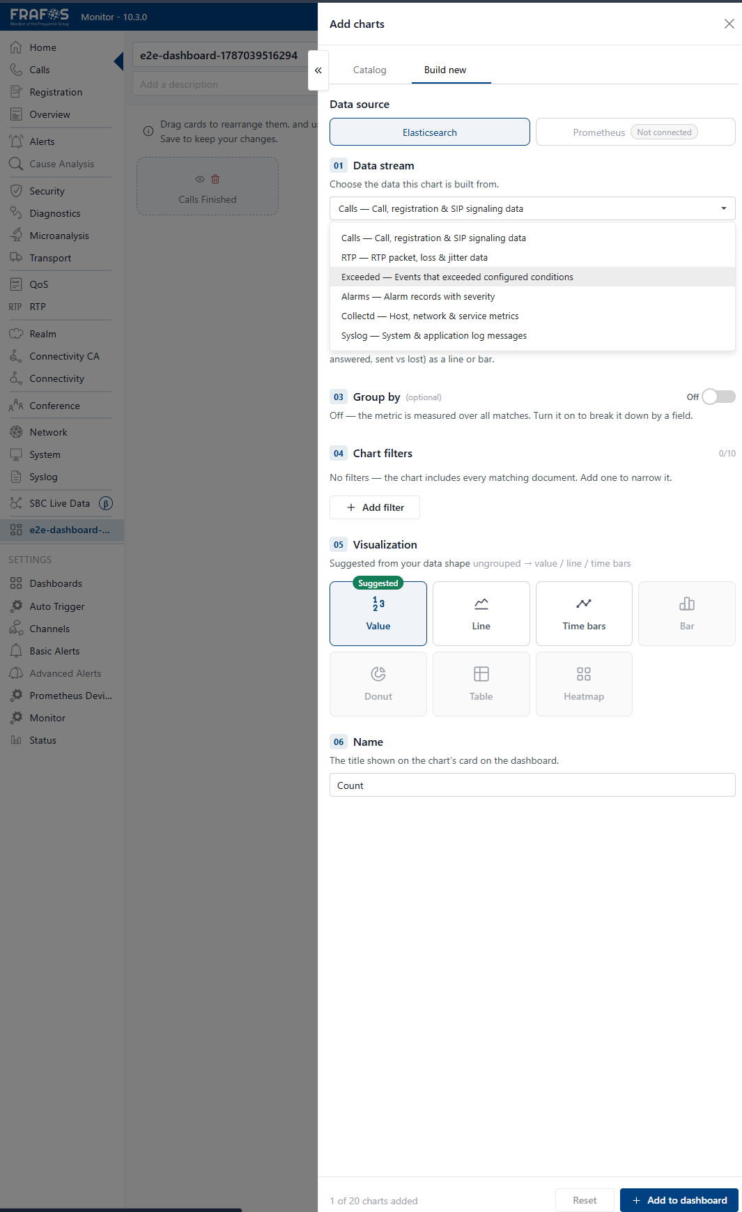
Click "Add to dashboard" to place the new chart on the grid, or click "Reset" to start fresh with a new configuration.
Prometheus Query Builder
The Prometheus Query Builder is available only if Prometheus is configured in your environment. If not configured, a notice will appear explaining how to set it up.
The Prometheus builder lets you create charts from Prometheus time-series metrics:
Step 1 — Metric
Select the Prometheus metric name from the available metrics.
Step 2 — Function
Choose a Prometheus aggregation function:
| Function | Description |
|---|---|
| Instant | Raw instantaneous value from Prometheus |
| avg_over_time | Average value over a specified time range |
| rate | Per-second average rate of increase (for counter metrics) |
| increase | Total increase over a specified time range |
Step 3 — Label Matchers
Filter metrics by label key-value pairs. Supported operators:
| Operator | Description |
|---|---|
eq | Equal to (exact match) |
neq | Not equal to |
re | Regex match |
nre | Not regex match |
Example: job="moki", instance=~"sbc-.*".
Prometheus Step 4 — Group by (Optional)
Group the results by a specific label to produce multiple time series.
Prometheus Step 5 — Topk (Optional)
Limit the number of resulting time series to the top k values.
Prometheus Step 6 — Visualization Type
Choose from:
| Visualization | Description |
|---|---|
| Value | Single numeric value |
| Line | Time-series line chart |
| Bar | Categorical bar chart |
| Table | Tabular data |
Unlike ES Builder, Prometheus builder supports fewer visualization types (no donut, heatmap, or timebar).
Prometheus Step 7 — Name
Enter a title for the chart (max. 60 characters).
Prometheus Live Preview
Just like ES Builder, a live preview pane shows a sample of the data as you configure the query.
Managing Your Dashboard
Editing and Arranging Charts
Once your dashboard has one or more charts, you can manage them on the grid:
- Drag to reposition — click and drag any chart card to move it to a different grid slot.
- Resize — grab the edges or corners of a chart card to resize it within the 12-column grid.
- Edit — click the Edit icon (pencil) on a chart card to reopen the builder/drawer pre-filled with the chart's existing configuration.
- Duplicate — click the Duplicate icon (copy) on a chart card to create a copy with the same configuration in a new grid slot.
- Remove — click the Remove (delete) icon on a chart card to delete it from the dashboard.
Edit Mode
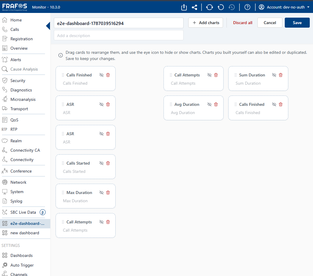
Click the Edit toggle button in the dashboard header to enter Edit Mode.
When Edit Mode is active:
- Chart cards display outline borders to indicate they can be rearranged.
- You can freely drag and resize charts without immediately persisting changes.
- Changes are buffered until you save (e.g., navigate away, or the dashboard is auto-synced).
- When you exit Edit Mode (or the changes are persisted), the buffered layout is applied.
Edit Mode gives you a scratchpad experience for dashboard layout. Your changes are only written to the server once you finalize them, so you can experiment freely without breaking the current layout.
Saving and Persistence
- Custom dashboards are stored server-side in the user profile.
- Changes auto-sync to your profile via the
updateUserProfileAPI call. - If a save operation fails (e.g., network error), the dashboard creation is rolled back and an error notification is shown.
Limits and Constraints
Custom dashboards have the following limits:
- Maximum 10 custom dashboards per user. If you try to create a dashboard when you already have 10, a warning notification appears and the creation is blocked.
- Maximum 20 charts per dashboard. If you try to add a chart when you already have 20, a warning notification appears and the addition is blocked.
- Maximum 60 characters for chart titles. The input field enforces this limit.
The dashboard grid is a 12-column layout. When chart cards wrap beyond the 12th column, they flow to the next row automatically.
Dashboard Manager
From the Custom tab in the sidebar, the Dashboard Manager gives you full CRUD (Create, Read, Update, Delete) control over your custom dashboards.
Searching
Use the search bar at the top of the manager page to filter dashboards by name or description.
Dashboard Table
The table shows all your custom dashboards sorted by last modified (most recent first):
| Column | Description |
|---|---|
| Dashboard | The dashboard name. Click it to navigate to the dashboard. Shows the optional description below the name. |
| Visibility | Toggle whether the dashboard appears in the sidebar. Hidden dashboards are not deleted — they are simply removed from sidebar navigation. |
| Actions | Click the three-dot (⋮) menu for additional options: Edit opens the dashboard in Edit Mode directly; Delete permanently removes the dashboard. |
Deleting a Dashboard
- Click the three-dot menu (⋮) on the dashboard row.
- Select Delete.
- A confirmation modal appears with the message: "Delete {name}? This permanently removes the dashboard and its charts. This can't be undone."
- Click Delete to confirm, or Cancel to abort.
Deleting a dashboard is permanent and irreversible. Make sure you no longer need the dashboard before confirming deletion.
Hiding a Dashboard
Click the visibility toggle on a dashboard row to hide it from the sidebar. Hidden dashboards remain server-side and can be made visible again at any time. Hiding is not the same as deleting — the dashboard and its charts are fully preserved.
Navigating to a Dashboard
Click on a dashboard name in the table to navigate directly to that dashboard. Click Edit in the Actions column to open a dashboard and immediately enter Edit Mode.
Quick Links
- Getting Started — Create your first dashboard
- Catalog Reference — Complete list of all available catalog charts
- Adding Charts from Catalog — Browse and add pre-built charts
- Building Custom Charts — Create charts from scratch
- Edit Mode Guide — Experiment with layouts without saving